at Length
Posts Tagged ‘Interview’
Amy Jorgensen
Tuesday, August 15th, 2017
Amy Jorgensen, interviewed by Debra Klomp Ching, about the Something Old, Something New, Something Borrowed, Something Blue series.
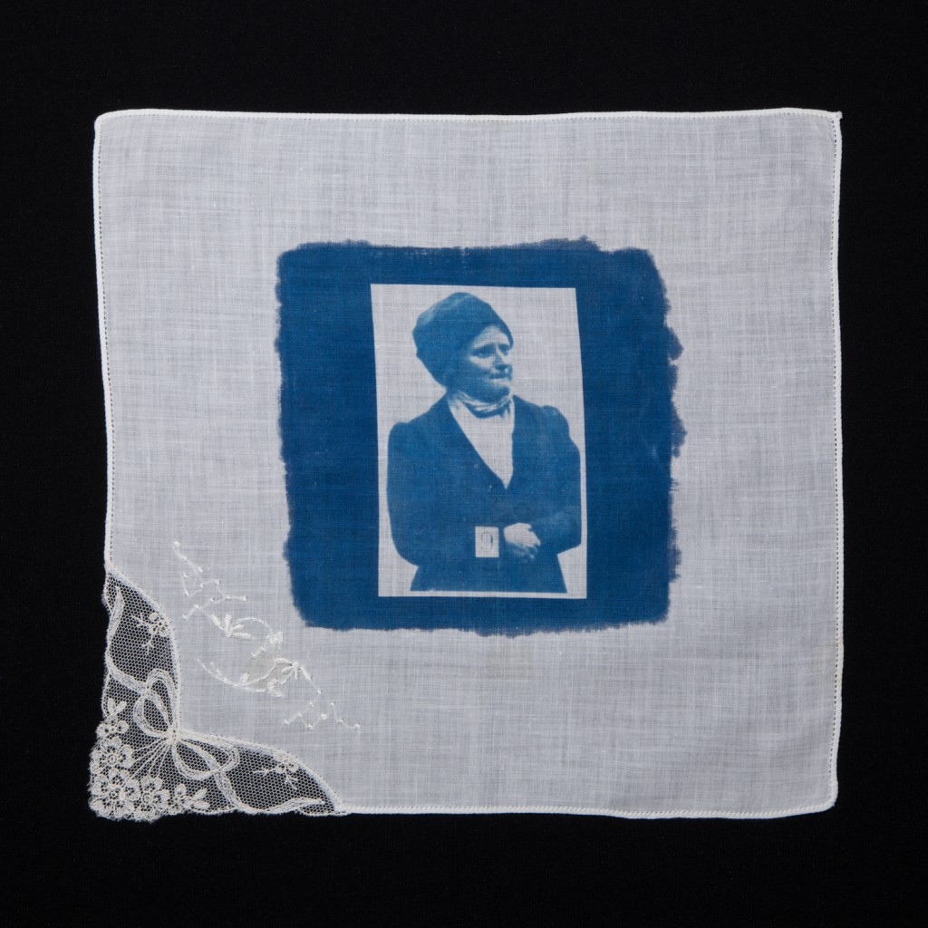 #9 Verity Oates (2016) ©Amy Jorgensen – 12″x12″ cyanotype on cotton handkerchief
At Length: I was first introduced to your series Something Old, Something New, Something Borrowed, Something Blue when we met at the Maine Media Workshops + College, and then later viewed it in person at your solo show at the Elizabeth Houston Gallery in New York. Can you start off by sharing what the initial inspiration for your project was?
Amy Jorgensen: The initial inspiration for Something Blue was my Great Aunt Edna Berg, who was a suffragette in New York City in the early part of the 20th century. A curator had asked me to participate in a show exploring intergenerational female themes, and I knew immediately Edna would be the starting point for this new work. As I began researching the details of her life and the work of early suffragettes, I discovered the recently unearthed archive of surveillance images made by the Scotland Yard in 1913.
This is a collection of eighteen images made of women who were militant suffragettes in the UK during the early part of the 20th century—the end of the Edwardian era. Over a nine-year period, just prior to the first world war, approximately 1000 women were sent to prison for their activity in the suffrage movement. Most of the surveillance images were taken while the women were in the yard at Holloway Prison, and they are reportedly the first surveillance images ever made, as the suffragettes refused to pose for photographs.
AL: How important is your personal narrative, in the story that you weave through the series?
AJ: The stories in my family about Edna are legendary; as a young person she occupied mythical status in my imagination. I never met her and only know her through family lore, but while I was navigating adolescence as a self-identified feminist, she certainly served as a role model.
She marched in the streets, used to have tea with Eleanor Roosevelt, debated politics loudly and fiercely, and was a vocal advocate for the rights of women. And there are small connections. My family lived in Italy for many years, and my parents would spend whole afternoons sitting with the linen and embroidery makers in Portofino. They cultivated life-long relationships with the women and had a deep appreciation for the traditional craft. These experiences undoubtedly influenced the making of this work.
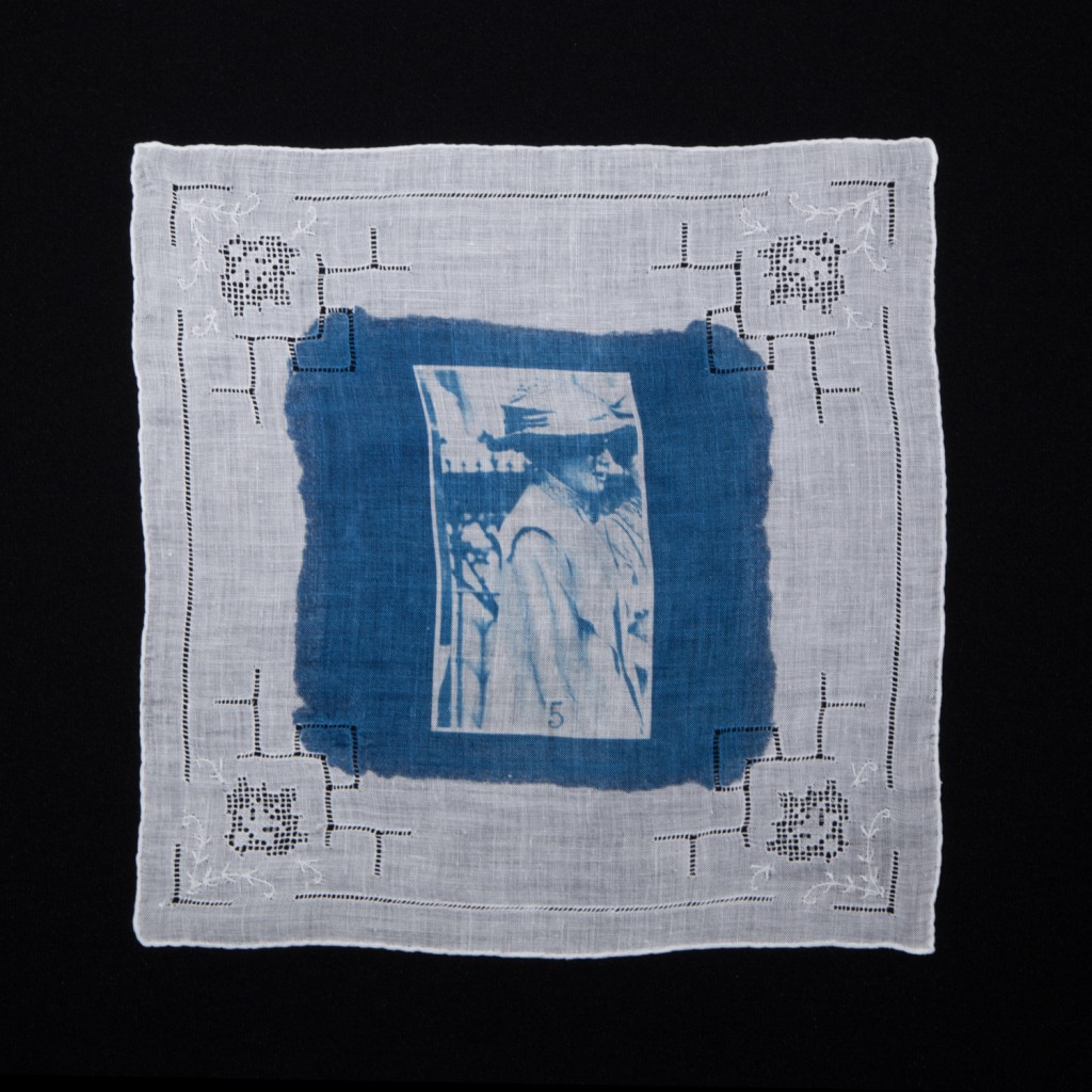 #5 Annie Bell (2016) ©Amy Jorgensen – 12″x12″ cyanotype on cotton handkerchief
AL: The title of the work is a familiar catchphrase, obviously conjuring up the realm of the female, specifically brides and wedding rituals. Did the title come early on in the project and how did you arrive at it?
AJ: The phrase first appears in the written record in 1876 in England, as a rhyme associated with good luck and fertility for a bride. Over time, the folklore phrase has become institutionalized in the traditions of matrimony—every bride needs something old, something new, something borrowed, and something blue.
What I like about this phrase, whether you subscribe to it’s superstitious nature or not, is that the tradition is about a generational, intimate exchange among women. The bride is gifted various objects by mothers, grandmothers, and close friends to wear close to her body on the day of her wedding. A handkerchief is worn next to the skin, close to the heart, inside the bra, a garter belt on the thigh…. They are usually objects that are feminine, made by other women, and often passed down through women in families. It is a ritual of sharing and intimacy.
Historically, marriage was a transaction negotiated by men. A woman passes from her father’s household to her husband’s household, dowries are paid, and maiden names exchanged for married names. In the loss of one identity for another, neither of which is entirely her own, I was intrigued by the acts of intimacy shared between women and the many points of conflict associated with matrimony in terms of identity, equality, autonomy and power. The phrase seemed a perfect catalyst to explore confrontational and sometimes contradictory themes.
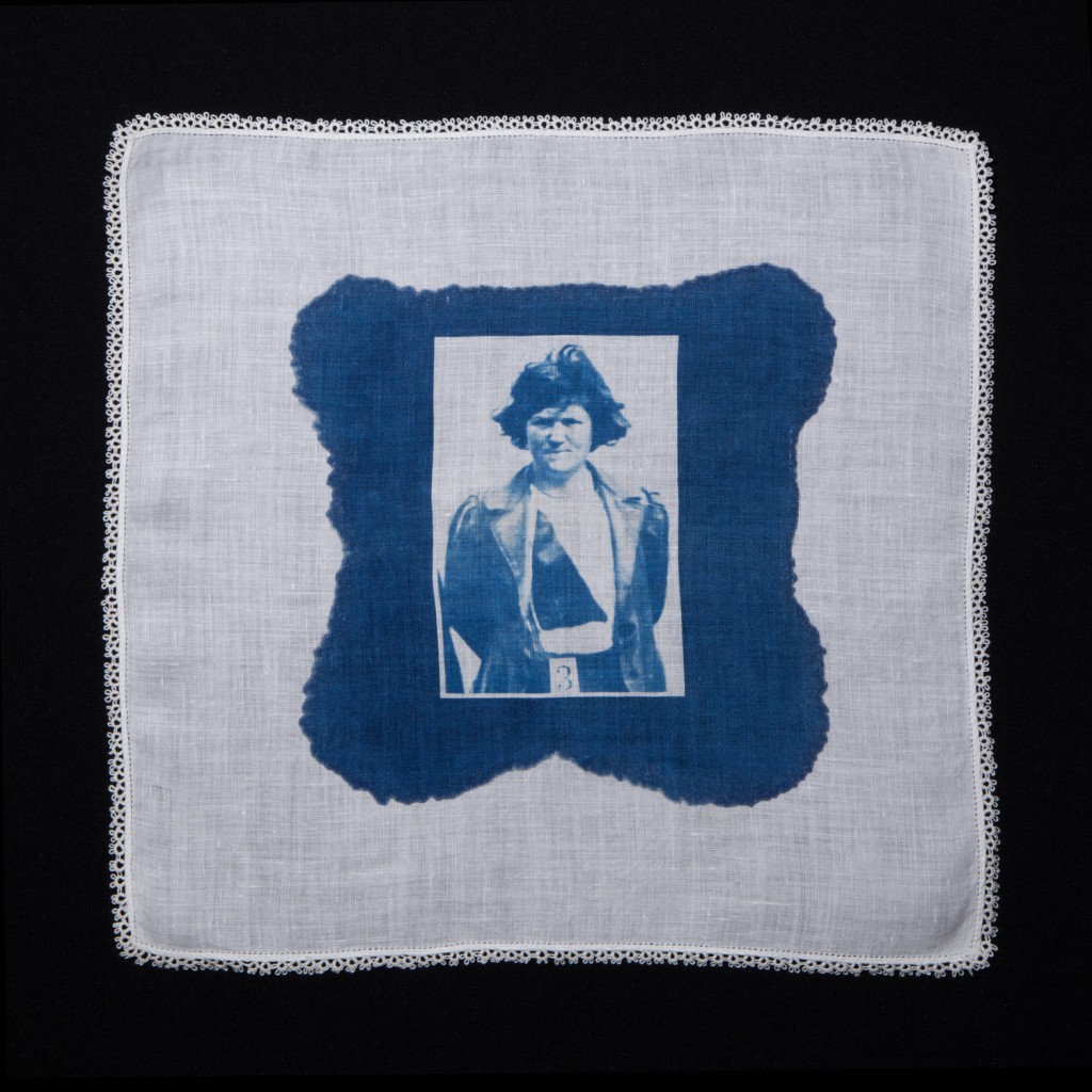 #3 Margaret McFarlane (2016) ©Amy Jorgensen – 12″x12″ cyanotype on cotton handkerchief
AL: This positioning of the work, firmly within feminist context, is further compounded by the materials used. Can you explain the meaning behind the combination of materials in this context—cyanotype, vintage handkerchief, archived imagery?
AJ: I chose the cyanotype process for a few reasons. It’s a historic 19th century process popularized by Anna Atkins, the first female photographer and the maker of the first photographic book. The cobalt blue is a deeply rich and seductive color, and because it’s a photographic solution that can be painted onto fabric, there is an element of the hand involved in making the image, in much the same way there is an element of the hand involved in the extraordinary embroidery work on many of the handkerchiefs.
Each surveillance image is printed onto a vintage handkerchief. These are objects that were made and worn by women, and often gifted for the wedding ceremony. Suffragettes commonly signed and exchanged handkerchiefs as a symbol of solidarity, using embroidery techniques to scribe their names or initials. In the 1970s a handkerchief surfaced with the signatures of 68 suffragettes imprisoned at Holloway Prison in 1912. Each name was embroidered, it’s an extraordinary document.
The parallel narratives of the matrimonial ceremony and suffragette surveillance imagery, provide a departure point to examine the role of patriarchal structures in history and contemporary culture.
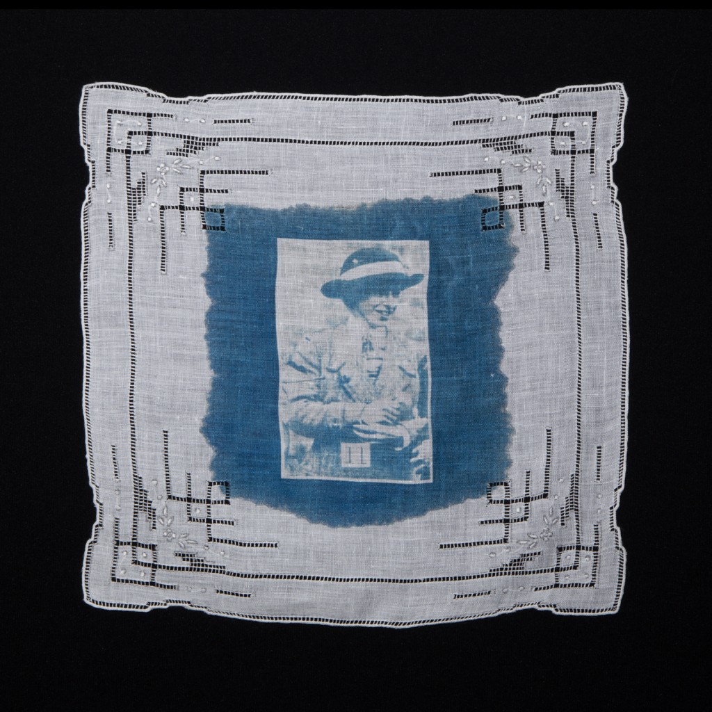 #11 Mary Raleigh Richardson (2016) ©Amy Jorgensen – 12″x12″ cyanotype on cotton handkerchief
AL: How important are the identity and personal stories of the women depicted in the photographs? Is there a key figure that interested you when making this work?
AJ: The work makes sense if you understand the general experience of the suffrage movement: however, these women have such compelling personal stories the details of their lives certainly add depth to the series. They ultimately came to the conclusion that militant participation and civil disobedience (bombing, arson, vandalism) were the only way forward to secure the vote for women. They were arrested on multiple occasions, imprisoned at Holloway, force-fed, participated in hunger and thirst strikes, beaten, and lived under the cover of aliases. Their experience conjures the phrase penned much later by Pulitzer Prize-winning author Laurel Thatcher Ulrich in a text about colonial women, “Well behaved women seldom make history.”
Mary Raleigh Richardson (#11) was arrested for slashing Diego Velazquez’s “Rokeby Venus” at the National Gallery in London. She did so in defiance of the government’s treatment of Emmeline Pankhurst, the leader of the Women’s Social and Political Union. She stated, “I have tried to destroy the picture of the most beautiful woman in mythological history as a protest against the Government destroying Mrs. Pankhurst, who is the most beautiful character in modern history.”
Long before John Berger introduced the concept of male gaze into the art lexicon, there was an intuitive awareness of the power of the male gaze. It was this destruction of artworks by Mary Richardson (#11), Lillian Forrester (#14), Evelyn Manestas (#10) and Annie Briggs (not pictured) that triggered Scotland Yard to make the eighteen surveillance images.The printed images with corresponding numbers on each card were handed out to detectives and gallery staff, an interesting historical parallel to the most-wanted playing cards used during the US invasion of Iraq. Surveillance, by construction, is inherently about the act of looking, and the first surveillance images ever made, were created because a woman acted in violent defiance of the male gaze.
In another example, Jane Short (6)—an alias for Rachel Peace who was an embroiderer—was force-fed three times a day for several months during a hunger and thirst strike. The experience left her in a fragile state and she spent the remainder of her life in and out of asylums. A well-to-do member of the Women’s Social and Political Union, Lady Constance Lytton, took responsibility for her life-long care. I was struck by the suffering of so many of these women in prison as they were violently restrained and force-fed, but also by the solidarity they shared as a community.
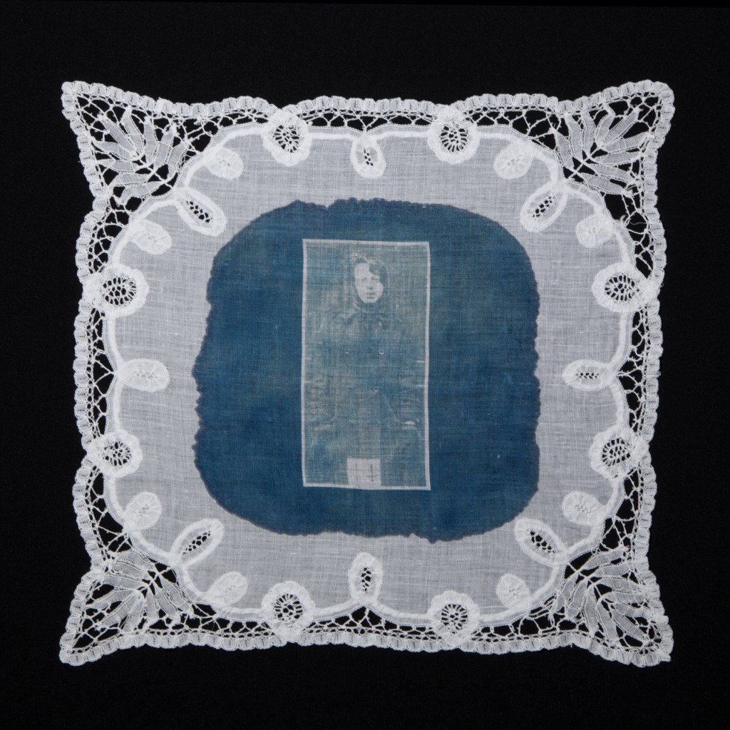 #14 Lillian Forrester (2016) ©Amy Jorgensen – 12″x12″ cyanotype on cotton handkerchief
AL: How and where do you find the handkerchiefs? Do any have a personal connection, for example, belonging to a female ancestor?
AJ: In the early printing stages all of the handkerchiefs were sourced from friends and family members, so each one was an heirloom object passed through the family. However, after a while I began to exhaust that resource; not everyone wants to give up all of their great grandmother’s hankies. So now I scour online estate sales and E-bay. However, I do make sure every edition includes a few heirloom handkerchiefs with a known history, as it’s an important part of the project for the objects to convey intimacy, both through their physical presence and lived history.
AL: There’s also an undercurrent of the taboo aspects of the female condition—widely explored within feminist art—that bind the female to her gender. For example, the use of the cyanotype on the handkerchief is reminiscent of menstrual flow on cotton. Is this connection a reach, or do you see this as an additional layer of the series?
AJ: Much of my work is situated in conversation with the body. In this series one can think of the handkerchief or cloth as being akin to the body, in both spiritual and feminist terms. Historically in visual art, the female body is most often acted or gazed upon, whereas I am interested in exploring the body as active and participatory. As the cyanotype solution spreads and soaks into the cloth, it mimics the staining of blood during the menstrual cycle. And while the cobalt color is obviously different, the patterning, saturation and mottledness of the final image is meant to convey a link to bleeding. The act of making this reference is a confrontation of the taboo, as much as women’s experiences outside of what conforms to convention remains unseen and unspoken.
AL: And of course the cultural/conceptual space of domesticity is visible.
AJ: Absolutely. On one hand this work is very much rooted in the domestic realm, the handwork, matrimony…. Yet there is also pushback. While the materiality of the project is very feminine it raises important questions about the cultural and economic value of women’s work, and perceptions of domestic ritual and space. The delicate object, or the domestic space, can also function as a form of protest and confrontation.
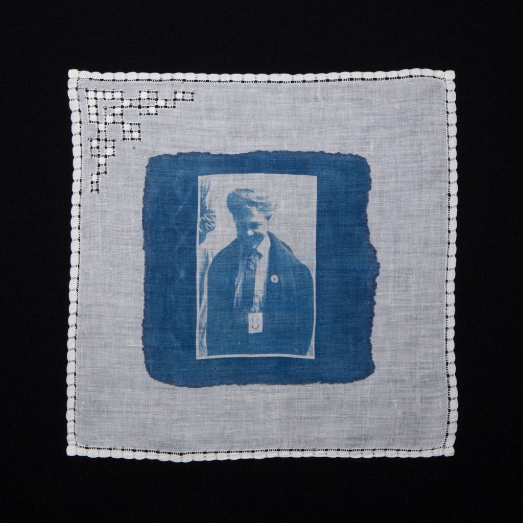 #8 Maud Brindley (2016) ©Amy Jorgensen – 12″x12″ cyanotype on cotton handkerchief
AL: Each photograph is unique, printed by hand onto an individual handkerchief. The labor of your hand is evident in the application of the cyanotype solution. Is this evidence of authorship important to you? How does this relate to the subject?
AJ: If we return to the title phrase, Something Old, Something New, Something Borrowed, Something Blue, it’s about connection and exchange. I see the application of the cyanotype solution, by my hand onto the handkerchief, as another layer of exchange and intimacy embedded into the object. The embroidery, the white work, the lace: All of this work was traditionally done by the hands of women. In brushing the cyanotype onto the handkerchief, in leaving the mark of my hand, I see myself contributing to the history of the object. A gift, if you will, to the next person who holds it close.
AL: When you exhibit the work, the handkerchiefs are pinned to the wall. How does this form of presentation add to the overall concept and message of the work? Are the pins dressmaker pins by any chance?
AJ: The handkerchiefs have an exquisite delicateness and materiality to them. In the exhibition context, each handkerchief is pinned to the wall in the upper corners with small pearlized dressmaker pins. This allows gravity to pull on them slightly, creating a soft sway in the material, giving them dimension and tactility. Because there is so much detail in each handkerchief viewers like to get close to them, and someone’s breath or movement in the room creates a reactionary movement in the handkerchiefs. I wanted the work to feel alive so that the connection between past and present becomes fluid. For collection and permanent hanging, framing and glass sometimes becomes necessary, but there is an element that is lost when they are placed behind glass. Handkerchiefs were designed to be held.
AL: The series is editioned as unique artworks with variations. How many pieces are in the series and how are collectors buying the work? Is it in pairs, multiples, singles?
There are eighteen images in the series, and it is editioned as 5 + 2 AP with variations. Every handkerchief is different, and the staining of the cyanotype chemistry is unique to each one. The primary interest is in individual images—I think people identify with a particular suffragette’s story or image.
AL: Have you printed the complete edition, or do you continue to print over time? Why is this?
AJ: I print the editions over time, really out of necessity, as it takes so long to source the handkerchiefs. In every collection of eighteen I like to have a combination of old, new, and borrowed pieces, including a few heirloom pieces with a known history. I also think about how the physical characteristics and aesthetics of each handkerchief pairs with the images and histories of individual suffragettes. It’s partly intuition; sometimes I simply know that this suffragette must be on this handkerchief. And lastly, I look at the collection as a whole. There is a lot of shuffling around on large tables to find the right balance.
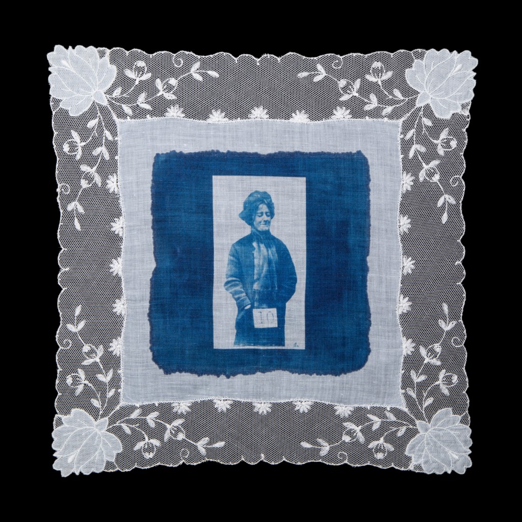 #10 Evelyn Manesta (2016) ©Amy Jorgensen – 12″x12″ cyanotype on cotton handkerchief
AL: What are the common responses to the work? Who is responding most effectively—curators, critics, photo editors?
AJ: To date, the most effective attention is coming from photo editors, who recognize their audiences are interested in themes of surveillance, power, suffrage and the relevance of these issues today. The work resonates strongly with contemporary women, regardless of where their personal politics fall on the spectrum of conservative to liberal. I think they identify on an intimate level with both the historical struggle of the suffragettes, and the current dialogue surrounding women’s equality.
A couple of art dealers have posed the question of the art market. More specifically, art about women does not sell; men buy most of the art, and men don’t buy art about women. This speaks to the heart of what Something Blue is about—changing the structures of patriarchy and equality for women. It is a question surrounding the value of domestic space and work. There is still much work to do.
AL: Where would you like to see this series situated in the long term? For example, it seems that the artworks could easily find a home in a museum’s photography collection, a collection on the history of the struggle for women’s equality, etc.
AJ: I would ideally love to see a complete set of eighteen collected by an institution with a specific focus on women’s art or women’s history. Conceptually, I like the idea of the work being viewed in a broader context of the women’s movement.
AL: Do you have any exhibitions planned for the future?
AJ: I have a solo exhibition in the fall and am putting together new work exploring the intersection of violence, power, and the body. My research into the early militant and radical practices of suffragettes has certainly informed this new work and I’m excited to see how it unfolds.
Amy Jorgensen is a visual artist working across photography, performance and video. She lives and works in Utah, United States.
Tags: Amy Jorgensen, Art Interview, at length mag, Cyanotype, Debra Klomp Ching, Feminist, Interview, Klompching, Photography, Suffragettes, Women In The Arts
Posted in Photography | No Comments »
Bill Durgin
Wednesday, November 2nd, 2016
interview by Darren Ching and Debra Klomp Ching
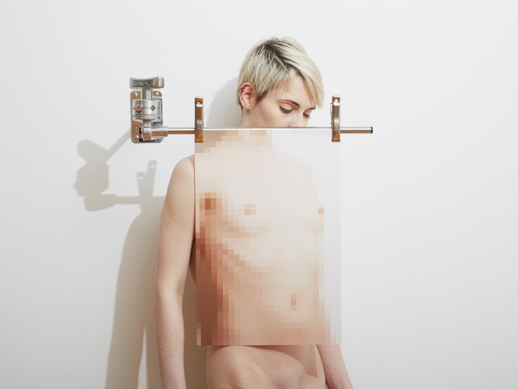 Adrian With Mosaic, 2015 © Bill Durgin
At Length: Your photographic practice, as a whole, engages with the human body. What initially inspired you to make this the focus of your practice?
Bill Durgin: I’ve always been fascinated by how the physical body how ages, the virtuosity of athletes, dancers, performers, and just how people inhabit space. For years I was reluctant to photograph the body as I wasn’t interested in the figurative photography work I’d seen. While working on an earlier series of narrative-based images, I became less fascinated with the before and after of the scene I was creating and more interested in creating something singular, something that did not have a before and after, something that existed only in one frame. It couldn’t be perceived as part of a scene that you would come across. This idea came to me of a torso draped with no arms or legs. I wanted to see if I could image that. I’d originally thought I would have to do it in postproduction, but while working with a friend who is a dancer, I realized how through contortion and perspective I could create this sculptural view in camera. I was hooked.
AL: The Fresh 2015 exhibition featured photographs from the “Studio Fantasy” series. Can you tell us more about this work—especially in terms of how it emerged from your previous series?
BD: While I was an undergrad at the School of the Museum of Fine Arts, I saw a television ad for Lagerfeld Photo eau de toilet. It showed a photo session in a shabby chic loft with a stereotypically beautiful model shooting with a stereotypically handsome photographer, no other production staff. Shot in black and white, very diffused, the shoot was a flirtatious dream sequence. At the time I was working in commercial photo studios and the school’s darkrooms, sweating, getting dirty, smelling of chemicals, schlepping equipment, enduring the demands of anxiety-inducing production schedules…. I loved the irony of it, seeing the photographic shoot portrayed as fantasy while working in its much less glamorous reality.
https://www.youtube.com/watch?v=pbS2ha5IQLY
I was reminded of this while shooting head shots for a friend. He brought a bottle of wine and offered me some. While I do love wine I can’t drink while I shoot and said so; there are too many variables to focus on, and I’ll inevitably mess something up. He was surprised and said he had a completely different picture of what I did on a daily basis. When I realized that even my friends had this fictionalized glamorous view of my studio practice the idea for Studio Fantasy came immediately. Unlike other series the name came first, and I started showing the edges of the sets and some of the banality around studio practice. In my previous bodies of work I carefully composed each image to avoid stray objects and supports. This series put those in the forefront. I wanted to depart from the set of rules I had laid upon myself, freeing up my technique and exploring some new ideas while still investigating new ways of imaging the body.
 Fake Wine Spill, 2015 © Bill Durgin
AL: In this body of work, you have maintained the human form as a central focus, but also incorporated photographs of objects without bodies. Why is this?
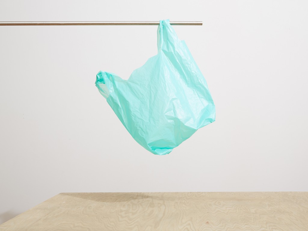
BD: Still lifes in the series are about making the banal beautiful, elevating studio tools and props to be the primary subject. Using gaffer tape to make a graphic tonal composition, the beauty of a plastic bag suspended from a C-stand, apple boxes leaning against each other with a print that visually erases one, a fake wine spill shot to reveal its inherent farce.
AL: In many respects, then, the studio, along with its various props, has emerged as a key subject. Can you tell us more about how you’ve explored this?
BD: “If I was an artist and I was in the studio, then whatever I was doing in the studio must be art.” – Bruce Nauman
The studio, specifically my studio, is the key subject in this series. Aside from the obvious titular reason, I’ve been interested in the labor of studio practice. I have always revered Bruce Naumans’s approach to working in the studio, going there everyday working through the boredom of being alone all day and making that the work. Also his approach to creative blockage, “It generally goes back to the idea that when you don’t know what to do then whatever it is you’re doing at the time becomes the work.” – Bruce Nauman
I use the studio as a blank slate from which to build an image. There were certain rules I set as my work working method: show edges of the set or parts of the studio, use minimal props, a single bare bulb light source, include any tool used including color charts. I start with an empty studio area and bring in whatever support catches my eye that day. When working with a model, I’ll direct them to where the focal point is and then we’ll improvise and refine a pose. I’ll then take part of that image, pixelate it, print it, then bring that back into the set and continue improvising and refining.
 Priscilla With Color Checker, 2015 © Bill Durgin
AL: It’s not just the studio that you examine, but this notion of the photographic space as well. What visual devices have you employed to examine these ideas?
BD: The camera itself is an editing tool; you are creating a visual space and omitting anything outside of the edge of the frame. The lens has a singular monocular view, which I exploit to achieve my composition, showing and hiding parts of the studio, the set, and sometimes the figure. “Studio Fantasy” is about making a photograph, not a documentary of what happens during the shoot.
I was looking at a lot of sculpture throughout this series. While I do see much work in person, I would always be looking at photographs of it in my studio. I was taking inspiration not just from the sculptures themselves but how they were translated into the photographic space. I treated my sets as a sculpture and documented them from a very specific perspective.
AL: The use of the pixilation appears to be a nod toward contemporary image consumption, through platforms such as social media, for example, but we wonder if there is something else going on. Can you expand on this element of the work?
BD: I saw an image on Instagram where someone had pixilated part of a body to fit the Community Guidelines. I was drawn to how the image looked more like a beautiful collage than a censored image. I could never find the image again, and perhaps it’s just the memory of that image that inspired this direction. I was drawn to the idea of using a form of censorship as a tool for incorporating a different dimensional plane within an image, like a collage. It also became a new way of abstracting the body and calling attention to the aspect of nudity rather than hiding it. The viewer becomes very aware of what is seen and what isn’t.
AL: How do you want your work to be received or understood in this context?
BD: I want the pixilation to be seen as a form of collage. I first saw it used in television news as a way to keep persons and incriminating documents anonymous. It was also sometimes used to hide nudity, often streakers at sporting events. Now I see it most often used on social media for the purpose of obscuring nudity, especially on Instagram. While I use it as a compositional tool, I also enjoy that it references anonymity and censorship.
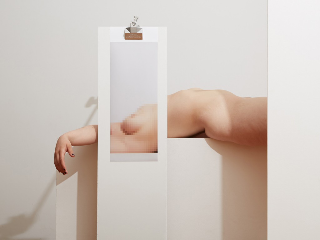 Jen With Mosaic, 2015 © Bill Durgin
AL: Overall, your practice presents itself as disciplined, formal, rigorous. How do you go about making what you do? What is your process?
BD: I usually start with a bare studio and an idea. That idea could be a sculpture I saw, a pose in a painting, a new piece of equipment in the studio, or just a piece of plywood leaning against the wall, and more often than not it is a combination of props and a pose. This idea is a launching point, something to set up before the shoot begins. When I get on set with the subject, a model, prop or myself, improvisation takes over. I select an area to be pixilated, print it out and bring it back into the set when improvisation takes over again. I’ll often have to do several prints, try different supports, a constant back and forth between staging the new set and improvising with it.
AL: Do you view your practice as a formal interrogation of the subject? If so, what are the key qualities or concerns that thread the different bodies of work together?
BD: My work is more of a personal interrogation of the subject(s). While there are definitely formal issues investigated, representation, figuration, compositional strategies, theories of perception, there’s also very personal motives and emotional content within the images. I’d say that the main elements that go through all my bodies of work are image construction and a constant push for the new ways to image the body through various formal and personal perspectives.
AL: Would it be fair to say that the “Studio Fantasy” series interweaves several theoretical/conceptual notions? For example, the photograph as constructed and mediated, the labor of the hand, scopic illusion and so on?
BD: Definitely. Since the beginning I’ve always focused on constructing photographs; it’s just what I’ve been drawn to do, and with each body of work a new set of concerns gets added: historical context, both photographic and art historical; the use of camera angle and perspective, and the gaze created by that perspective; studio labor; body image; photographic space as partial truth. Some images address more concepts than others, and “Studio Fantasy” brings in ideas of creating images in a digital age while the construction of those images finds its core in hands-on studio technique.
AL: The color palette of the series is very restricted, why is this?
BD: I wanted the studio to be the ground from which these images emerged, so that determined the palette. Being a minimalist, adding color wasn’t a concern. I guess my studio just isn’t very colorful.
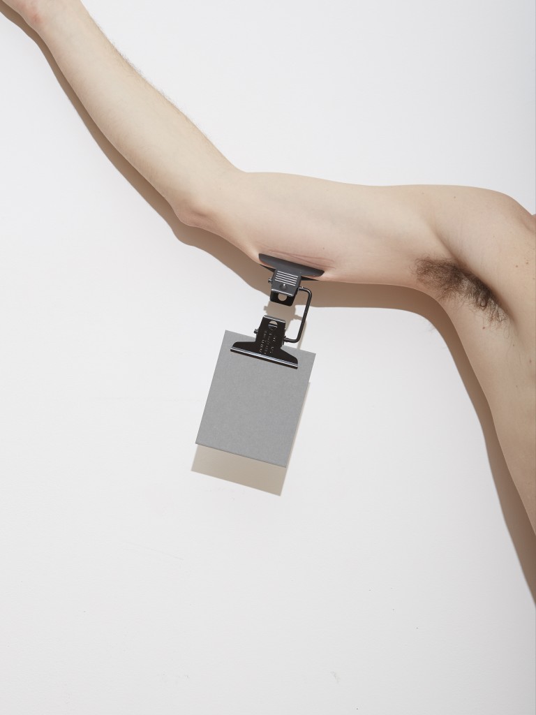
Self Portrait, Gray Card and Multiclip, 2015 © Bill Durgin
AL: It’s also somewhat quieter than your previous work, less risqué. Do you think this helps to make photographs more accessible and palatable to art collectors? Or, if this not a concern or conscious shift?
BD: I actually thought this work was more risqué, bringing the topic of nudity right to the front. Perhaps the bodies are more recognizable, but there was no conscious effort to make anything more palatable. I wasn’t thinking of sales while making it, just ideas and experimentation.
AL: Following the Fresh 2015 exhibition, you were shortlisted for the Aperture Portfolio Prize. What impact has this exposure had on your success as an artist, and what is next on the horizon?
BD: It was an honor to be in Fresh 2015 and shortlisted for the Aperture Portfolio Prize. I definitely had a bump in exposure, but most of all it is validating as an artist to be recognized for your work. This was a new direction for me, so it has encouraged me to continue expanding, growing and experimenting with my work. Right now I’m working on a series entitled “Figure-Ground,” stemming from the principal in gestalt theory that a figure is perceived through its distinction from its background. I am layering several images from a single shoot, partially erasing and layering figures, blurring the boundary between what is figure and what is background.
Tags: Bill Durgin, Fresh2015, Interview, Klompching Gallery, Photography, Studio Fantasy
Posted in Photography | No Comments »
