by Anna Von Mertens
edited by Elaine Bleakney
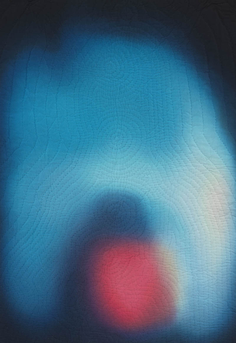
Mona Lisa’s Aura, 2009. Hand-dyed, hand-stitched cotton, 34 3/4″ x 25 3/4.” Courtesy of Sara Meltzer Gallery
This series was the first time I came at an idea through technique. In my previous series “Endings” I was painting dye onto fabric and slowly blending colors together to create scenes at dawn and dusk. I offhandedly commented how the way the dye bled together reminded me of aura photographs. As soon as I said that, the idea of “auras” clicked in my brain and wouldn’t go away. I wanted it to go away, because I thought the idea was absurd. But I couldn’t shake it.
La Gioconda Leonardo da Vinci
I chose paintings familiar to me from my undergraduate days in my first survey art history class, when you get to know artworks as projected slides in a dark auditorium. Because I was researching not only who the subject was in each painting but also the relationship between painter and sitter, I focused on portraits where that relationship was unique or intense.
Bacchus’s Aura, After Caravaggio, 2009, hand-dyed, hand-stitched cotton, 39 3/4″ x 33.” Courtesy of Sara Meltzer Gallery
I remember falling in love with Caravaggio in that dark auditorium. Seeing slide after boring slide, Caravaggio’s in-your-face painting style, breaking the plane of the painting, was such a dramatic contrast. The way he painted Bacchus offering the viewer that glass of wine was so seductive, and learning that Caravaggio was probably a homosexual, the invitation from this young god with a raised eyebrow seemed all the more provocative.
Bacchus, Caravaggio
I wanted to carry some of that tension and seduction in the aura representing Bacchus. I had more room to play with, considering Bacchus is the one fictional character included in this series. I started with a color that matched Bacchus’s traits—the God of wine and the debaucherous revelry that comes with such things: orange indicating pleasure, sexuality, vanity, enjoyment, and thrill as well as addictions and appetites.
I created this luminous glow of orange so intense it is hard not to look at, not to get sucked in. But in the shape of a mushroom cloud it becomes a warning sign. Both pulling you into the piece with its beauty, but finding trouble once you get there—the same push and pull I first discovered in Caravaggio’s work.
*
Battista Sforza and Federico da Montefeltro’s Auras, After della Francesca, 2009, hand-dyed, hand-stitched cotton, 18″ x 13″ (each). Courtesy of Sara Meltzer Gallery
If anything surprised me about this project, I think it was how following the prescribed codes of color meaning from aura photography led to quite accurate representations of what I saw held in the original portraits.
Portraits of Battista Sforza and Federico da Montefeltro, Piero della Francesca
In this famous diptych by Piero della Francesca (in part so famous because of the striking profile of Federico da Montefeltro missing part of his nose) Battista Sforza was thought to be painted posthumously or just before she died in childbirth. In aura photography, when someone is close to death and “angels are near” the aura is mostly white; when a woman is pregnant, white clouds bursts appear in the aura.
Sforza had eight children in her very short life, so I represented her as a maternal green, but largely bleached out because of the predominance of white in her aura. This effect matched the extremely pale countenance Francesca painted originally.
This contrasts with the deep red of Montefeltro’s aura representing his strong willpower and ability to achieve goals. I like that in Francesca’s diptych two very different faces stare at one another in profile, and that same contrast is reflected in my two auras: one presence very masculine, very assertive, the other representing hard years of motherhood in the fifteenth century.
*
Arrangement in Grey and Black’s Aura (Whistler’s Mother), After James Whistler, 2009, hand-dyed, hand-stitched cotton, 54 1/2″ x 63 1/2.” Courtesy of Sara Meltzer Gallery
In all of my portraits, I wanted to reference the original painting, so for the stitch patterns I projected the original painting onto the fabric and traced the silhouette and the sitter’s chakra centers. From this I created an auralike emanation of expanding energy that on close inspection reveals the figure and a reference to the original painting while also eluding to something else.
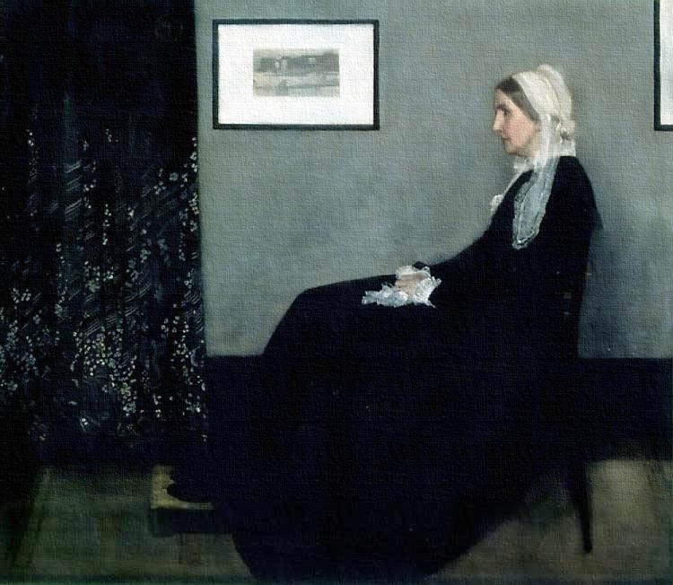
Arrangement in Grey and Black: The Artist’s Mother, James McNeill Whistler
The evolution of Whistler’s mother’s aura was unique, as I played more directly with the composition of the original painting.
There are two formats of aura photography: a Polaroid documenting the aura around the head that mirrors the standard head and shoulder portrait format. The second is a scan that shows a full-body aura along with the color and condition of each chakra (these auras are more technical—and I think strange).
While all of Whistler’s mother’s body is shown in the painting, the head and shoulder aura format felt like a better match. So I played with the composition—arranging the aura around Whistler’s mother’s head against a vast black space. Angles in the aura reference her stiff spine and hands folded in her lap, the gesture so well-known from the original.
I had thought of Whistler’s painting as stark and plain, but I was surprised by the ornate pattern detail in the draped curtains on the left side of the painting. So I gave the curtains their own “aura,” playing with shades of grey, acknowledging Whistler’s very specific conceptual stance with this painting, reflected in its title “Arrangement in Grey and Black.” He didn’t see his work as a portrait, but as a formal study, particularly accented in the black mass of his mother’s dress. In honor of his intent, I gave a compostional focus to this piece.
*
Marilyn Monroe (II.23) and (II.31), Andy Warhol, via guyhepner.com
Marilyn had so many different facets, her small town upbringing, her glamour, her legendary moods on set. But it wasn’t like these parts were hidden—they were all out in the open, common knowledge. So I tried to bring all of those elements to the surface, where you are uncertain which is the “good” portrait and which is the “bad.”
Same with Warhol’s screenprints—some of the color combinations were gorgeous, some felt off-kilter, but all felt on equal ground. I chose to do two aura portraits of Marilyn Monroe in honor of the Warhol series because in making a pair of portraits I could mirror what I found to be quite common in the presentation of aura portraits: there’s a “before” and “after.” Often aura portraits are taken before and after a workshop, or before and after crystal therapy, etc.
Marilyn Monroe’s Aura (II.23) and (II.31), After Warhol, 2009, hand-dyed, hand-stitched cotton, 35 1/2″ x 35 1/2.” Courtesy of Sara Meltzer Gallery
I like examining the difference between the two. On the one hand you can use the color definitions of aura interpretation to determine a benefit or shift between the two portraits or remove this kind of judgment in seeing good or bad. I like seeing what shifts and what stays the same.
*
One of my favorite comments from the exhibition of my work this winter was that one of the pieces looked like the Shroud of Turin. Which is fitting, as it reflects the technical process: these portraits slowly emerged from a blank, white sheet of cotton.
I was asked a lot of technical questions about how the color was applied, as it does have a strange visual effect that comes from the slow application of color. I applied seven or more layers to build up the color so that it blended seamlessly. The dye chemically bonds to the fabric’s fibers so that it is truly a part of the fabric.
While the steady progress (at times frustratingly slow!) to build the color did allow time to contemplate a core intention I was trying to channel from the original work, there was also the result that the aura felt like it was emerging from the fabric versus something I was laying on top of it.
The dye chemically reacts with the fabric, so the color gets stronger with time. The process is very technically challenging, in fact at first I didn’t think I’d be able to figure it out. There is a certain element of being out of control. It’s impossible to fully control the dye. I like thinking I’m in control, but then having to react to what is forming in front of me.
Detail of Marilyn Monroe’s Aura (II.31), After Warhol
I do all of my dyeing in our basement, a perfect use of extra space where all I really need is a sink and a large working surface.
For the stitching I use a quilting hoop, so the work is very portable. I pretty much set up where I can—studio, living room, wherever I go if I’m under deadline. There are hours and hours of stitching ahead of me and I am very grateful all radio programs seem to have fantastic web archives.
Detail of Bacchus’s Aura, After Caravaggio
While it sounds cliché, stitching is therapeutic. I can get flooded with existential angst (not to be too dramatic) but stitching brings me back into the present.
The fact that I can do the sewing anywhere is a reflection of the medium’s utilitarian and quotidian roots. I think it gives the objects a kind of humility that makes the work more approachable.
I have always loved that their are different stages to my process—first the research, then the color, then the stitching. I look forward to each step (and then of course get tired of each step and eagerly await the next!) Each step invigorates the process anew.
*
Anna Von Mertens’s work has appeared in solo exhibitions at Sara Meltzer Gallery in New York City, Elizabeth Leach Gallery in Portland, OR, Mills College Art Museum in Oakland, CA, Headlands Center for the Arts, Sausalito, CA, and many others. She received the Louis Comfort Tiffany Foundation Biennial Award in 2007. A graduate of Brown University and the MFA program at California College of Arts and Crafts, she lives in Peterborough, New Hampshire.
