Fatimah Asghar’s debut collection of poetry, If They Come For Us, was released on August 7, 2018. The cover art immediately struck my eye, especially because Fati referred to it as a collaboration between herself and the visual artist who created it, Shyama Golden. Far from the simplistic and clichéd maxims we all know too well, the relationship between the contents of a book and the artwork and design of that book’s cover is a complex conversation. Both are their own pieces of art, and they are also both necessarily—perpetually—in relation to one another. More still, because Shyama created this piece after reading Fati’s book, specifically for Fati’s book, in this case the cover is also an ekphrasis of sorts: an artistic representation in one medium of another piece of art in another medium. I asked Fati and Shyama a few questions about this process, about If They Come For Us, and about their approaches to their arts, and asked Shyama to share a few other pieces of her work. Their resulting answers have been edited together below.
—Sumita Chakraborty, Art Editor
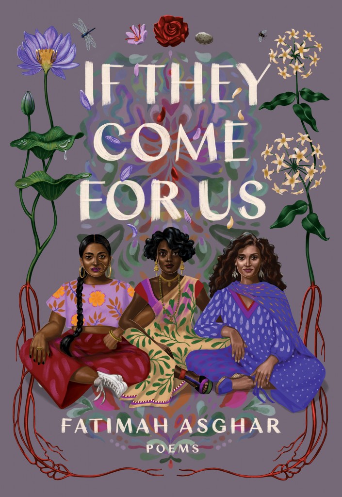
If They Come For Us by Shyama Golden | If They Come For Us by Fatimah Asghar
Fatimah Asghar: The original thing that I thought the book cover was going to be was a lot different—I was picturing a crowded train since trains figure so heavily in the book. Once Shyama came in she really blew open the cover and made it her own.
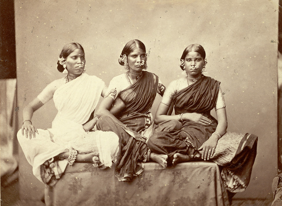
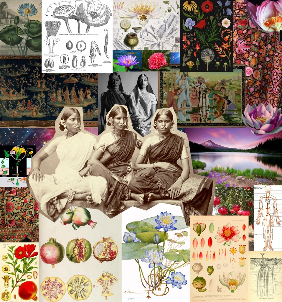
Shyama Golden: As is typical with this kind of job, I had almost no contact with the author until the end, but worked directly with the publisher. Still, it was very much a collaboration with Fati through her written words which directly inspired the work. First, I read the whole book and completely fell in love with it. It was heartbreaking, beautiful, and even sharply witty. I researched a lot of reference images relating to themes in Fati’s poetry, and compiled them into a mood-board, hoping to imbue my sketches with the qualities of those collected images. Among them were many flowers native to Pakistan and Kashmir, and one particular archival photo of three women seated together with arms interlocking. I felt that image had the feeling of defiant celebration outlined in the brief, and I based my three women on their poses, while making up their faces and personas. I had experimented with a colorful pattern in the background to represent Fati’s queer identity and pride, and I started to doubt myself on whether it was working visually, but Fati loved it so much I pushed myself to refine it and make it work. I’m so happy that she convinced me to stick to that original vision because I think it gives the cover so much more energy and spirit.
Gentoo dancing girls from Madras, displaying jewellery
a studio portrait of three dancing girls taken by Nicholas & Curths in 1870, from the Archaeological Survey of India Collections
courtesy of The British Library
the archival photograph that served as part of Shyama Golden’s inspiration for the three women in If They Come For Us
Shyama Golden’s mood-board for If They Come For Us
Sumita Chakraborty: Fati, is there an element of the cover that’s your favorite?
Fatimah: I really love the background watercolor. To me, it really brings the images together. Shyama put it in there as a celebration of queerness and queer identity, and it means a lot to me.
Shyama: The dissected lotus was my way of exploring the questions of gender and sexuality in Fati’s writing. Plants are visibly both male and female, and I am using it as an example of the complexity of gender and how a person can experience the fluidity of gender. I wanted to show how natural it is. The rose is in the center top because it represents Fati’s identity as an American. The stone and flower next to it refer to specific lines referencing each of her parents. She mentions blood as a symbol of connection to other South Asians, and I think that connection is a central theme of the book, which is why I feel like the “roots” of the flowers running red with blood is so fitting for the cover. The blood carries many more meanings throughout the book as well, including coming of age as a woman, and the violence and shared trauma that Fati writes about. Another theme in her work is that there is a lot more than just pain that comes from being connected to her people: there is beauty and celebration too. I thought the veins blossoming into flowers could convey this visually.
Fatimah: Shyama put jasmines (the national flower of Pakistan), lotuses (the national flower of Kashmir and India), and roses (the national flower of the United States). She also cut some of the flowers in half to represent the male and female parts in the flowers. The saffron and stone she put in for my parents. The roots and stems turn to blood and veins, representing the connection to people and land.
Sumita: Shyama, while this isn’t exclusively the case, a number of your pieces—like If They Come For Us—portray your subject gazing directly at the viewer, so that the gazes of both viewer and subject seem to meet head-on. Can you speak a little bit about this formal decision, when you tend to use it, and what you hope that gaze communicates?
Shyama: This sort of portrait is almost like a diagram or a map of a person. I am attempting to distill them down into an arresting image with the power to look you directly in the eye. I also try not to assert gender stereotypes into my poses. Typically I’ve noticed that women are shown in passive poses, lying down in a vulnerable state, while men are shown in more heroic or active poses, and I think it might be more interesting to break people away from those lanes.
Fatimah: To me, the cover art really is a celebration of solidarity, of understanding each other’s fights in a series of systematic issues and showing up for each other. It’s also a celebration of culture and heritage—all of the people of the front are wearing hybrids of South Asian clothing and Western clothing.
Sumita: Fati, if you had to borrow one—but only one!—piece of clothing or accessory from each of the women in the cover, what would it be?
Fatimah: From the one on the left I’d take the nose ring, the one in the center I’d take the sari (am I allowed the blouse too? Can’t be just out here with the titties, right?), and the one on the right I’d take the shoes.
Sumita: It’s so interesting to me that the first image you had in mind of the book’s cover was of a train, which is a vehicle and therefore mostly imagined as in transit and in motion, whereas in what became the actual cover, roots (literally!) and rootedness (figuratively) end up featuring so heavily. Is there something to be said about the transition between those two things for you? Do you feel like the sense of your book and yourself as an artist transformed in some way that does (or doesn’t!) map onto that shift?
Fatimah: What it felt like to me was true collaboration between two artists: Shyama and myself. It was such a different direction than what I thought, but because of how closely Shyama had read the book I knew that I trusted her, and I knew that was a better direction to go in. Coming up with a book cover is strange because there are so many elements to a book and you have to choose what you highlight—there’s a lot of darkness in my book, and the current cover does such an excellent job in highlighting the groundedness, the love, the hope of it. It’s a great perspective shift and I’m glad that we chose this direction instead of sitting in the hardship of movement, refugee status, and history of Partition.
Sumita: Shyama, I see that you often work collaboratively with written media; you’ve done gorgeous illustrations before for journalistic articles, for example, and I loved exploring Catsquatch, an illustrated book for ages 12+. Are there certain kinds of written pieces that you especially enjoy working with? Can you describe the process of creating a visual piece inspired by, or in tandem with, a written work?
Shyama: For me this process is very intuitive. I will usually get images in my head as I read a text (or write one) and I sketch the ideas out roughly until they match what’s in my head, and keep refining from there. My favorite types of text to work with tend to have a poetic or magical realist slant to them, where things appear more as they feel than as they are in the real world.
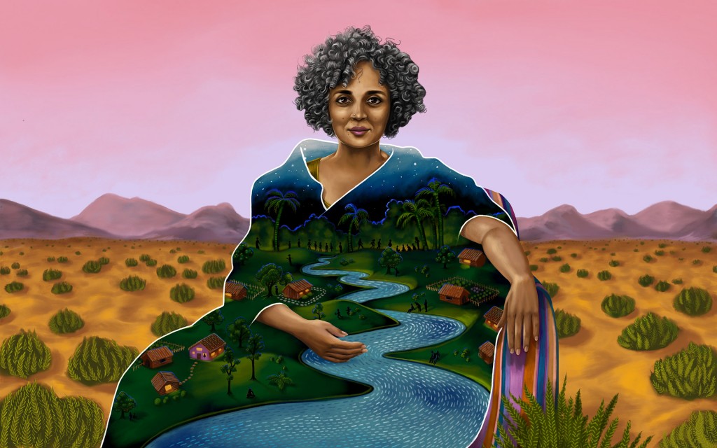
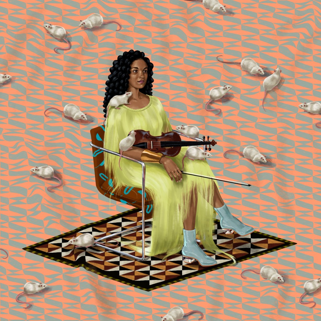
Arundhati by Shyama Golden
a portrait of Arundhati Roy for The Atlantic
Thilini by Shyama Golden
a digital study for a future oil painting of a friend of the artist
We Are Family by Shyama Golden
for a forthcoming photography book about the Pulse Nightclub shooting by Cassi Alexandra
Sumita: Shyama, your portfolio shows an incredible range of artwork, from portraits to patterned graphics and near-fantastical hybrids of animals. Can you describe the kinds of subjects that interest you as an artist?
Shyama: I think the common thread in my work would be a sense of personality and character. People project personalities onto images of people as well as animals, and that’s something I play with in my work. I also like to keep things open ended for the viewer to bring their own perspective to it.
Sumita: I love the way your style uses contrast and emphasis to tie the viewer’s attention to the strong primary subject of the work—whether that subject is Biggie or a Brachiosaurus with what looks like a twist on a midcentury white American dinner scene inside, whether it’s Shonda Rhimes or a Sasquatch made of cats, whether it’s Arundhati Roy or your work-in-perpetual-progress creating a pattern inspired by the garbage islands in the South Pacific. As a viewer, I tend to feel as though I’m being captivated into a conversation with the main object while we are both pulled into the world of your often luminous and bold backgrounds. Could you tell me a little bit about the feelings that you hope to evoke in your viewer, and some of your preferred formal techniques for evoking them?
Shyama: Interesting that you bring up contrast; I think that might be my favorite element to use. It may come from my graphic design background, but to me, contrast and context are everything. My goal is to make people think rather than telling them what to think. By having contrasting elements in a painting, I hope to hold that conversation with the viewer a little longer by reflecting the contradictions and complexity I see in the real world. I also think contrasting elements can riff off of each other to draw an emotional response. There is humor in the contrast of cuteness and savageness, which is why I’m drawn to cats. Sadness is sadder when it is discovered in something that at first appears joyful, like the colorful plastics strewn across the oceans, and beauty is more interesting when it has what society considers “flaws.”
Sumita: I see that your preferred mediums are oils and digital painting on the iPad Pro. Do you find that one is better suited than the other? I was amazed when I saw that If They Come For Us (which I’d pegged as oils!) was done digitally in the Procreate app. Is there a particular reason you felt that digital media would be best for If They Come For Us?
Shyama: That is great to hear, because my intention is to mimic my oil painterly style in my digital work as closely as possible. There are many advantages to oils, such as physical presence and texture, but there are also advantages to working digitally, including being able to output work on a deadline and the greater potential for animation or seamless pattern tiling, as well as not being dependent on a good photograph to capture it properly at the end of the process. Client work which is destined for print or screen is better suited to digital mediums, whereas for personal work, where I have more time, I can indulge myself in the time-consuming, but very satisfying, process of oils.
Sumita: Fati, much of your poetry is also highly visual: I’m thinking of the table format of “From,” the floorplan-like form of “Script for Child Services: A Floor Plan,” the mad-libs format of one of the “Partition” poems, the bingo sheet of “Microaggression Bingo,” the crossword puzzle of “Map Home.” These are, of course, only a few of the most straightforward and most recent examples; you’ve engaged with the visual for a long time, both in poetry and in other media like the rich, detailed, and stunning Brown Girls. Even the poems that are less outwardly “visual” always evidence careful attention to the form and the shape they take on the page. Could you say a few words about what the visual arts mean to your craft as a poet and an artist, and to you broadly or personally?
Fatimah: When I was young I painted a lot; visual art has always been important to me. I love filmmaking because I love the way that it combines so many different kind of genres. Terrance Hayes once said in an interview that poems are the decathlon of writing—they contain everything. I love that approach. I think poems can be anything and I long for a genre-less world.
Sumita: Can you say more about “a genre-less world”? Or, to put it another way: what do you feel like we lose as a result of genre?
Fatimah: Freedom and innovation. Sometimes we get so stuck in artificial ideas of genre that they become sticking points for things: “Oh, you can’t do that in a poem,” “You can’t do that in a comedy,” etc, etc. It becomes a way of enforcing rules that don’t actually matter and stifling innovation. I can’t tell you how many times I’ve handed in a poem somewhere and people are like, “This isn’t a poem.” Why? Because it leans into narrative? Because it’s a visual? It’s a poem because I said it is. I don’t understand what we get from policing genre, or what joy or excitement comes from that space. I think about this a lot in the terms of gender and sexuality. Why can’t people just be who they are, love who they love? It pains me the way that society always tries to police everything.
Sumita: Imagine spending a day in the world of your book’s cover. What does it feel like, smell like, sound like? How do you feel there?
Fatimah: It smells like jasmine and the watercolor center feels like a kaleidoscope. Besides you are your chosen family, ready to take the journey with you.
___
Fatimah Asghar is the creator of the Emmy-nominated web series Brown Girls, now in development for HBO. She is the author of If They Come For Us (One World/Random House August 2018) and a recipient of a 2017 Ruth Lilly and Dorothy Sargent Rosenberg Fellowship. In 2017 she was listed on Forbes‘ 30 Under 30 list.
Shyama Golden‘s background is in oil painting and graphic design. She worked as a designer for a decade before transitioning into figurative art. Patterns, people, and nature are common elements in her work in both oil and digital mediums, and she is based in Brooklyn, NY. Find her on Instagram and Twitter at @shyamagolden.
